Welcome to our brand new website
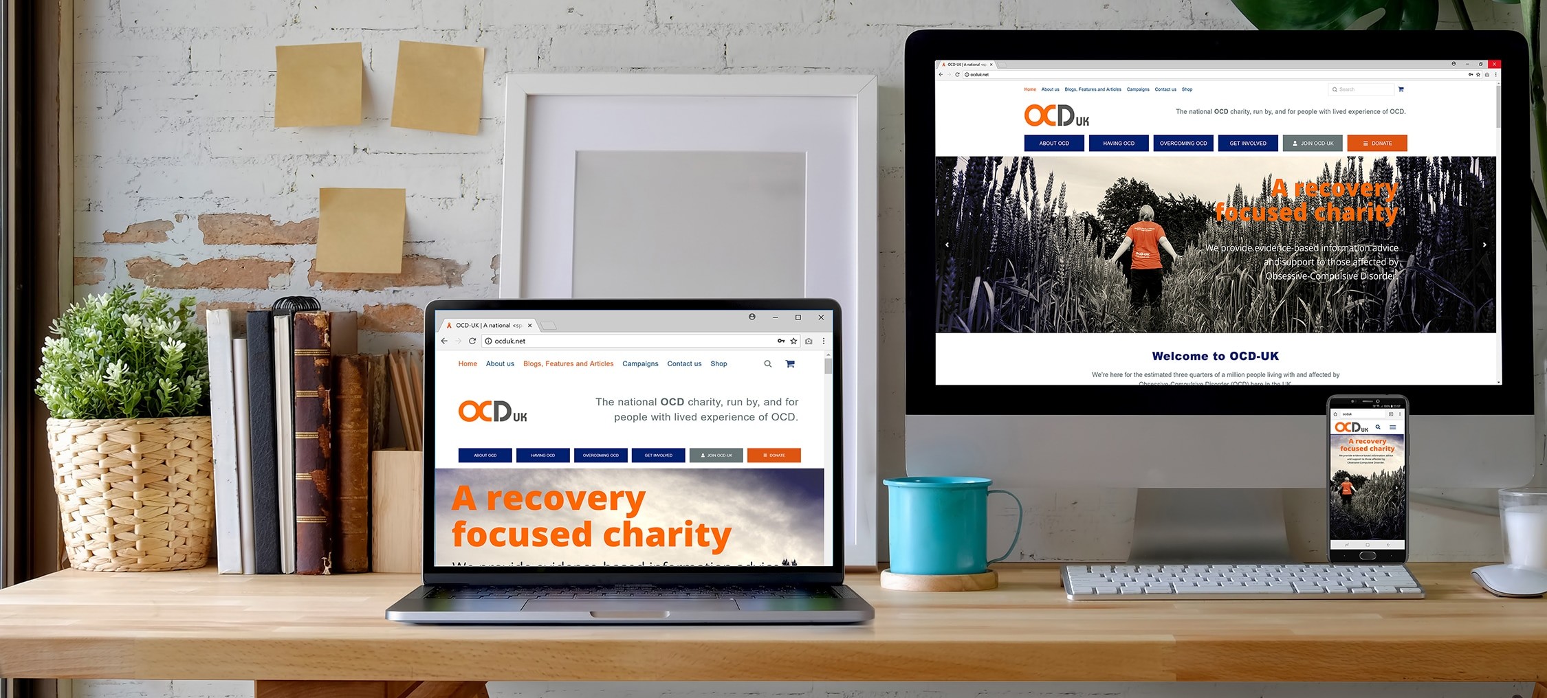
Well hello to you, and hello to our BRAND NEW website. Months in the making, we’re delighted to launch the beta version of our brand new website, we hope you like it!
But before we tell you all about it, the first thing we want to do is thank some of our amazing volunteers who made this new website a reality, volunteers who have spent hundreds of hours helping write new content, update old content and proofread 300+ webpages of content, so thank you so much to Gemma, Laura and Sue and all the other volunteers who submitted content, too many to mention and not forgetting the volunteers who stepped in to cover other aspects of the charity’s work whilst the team cracked on with developing the site.
Simplified and straightforward design
Nobody likes change and it’s fair to say our experience of changing our forum design not so long ago is that this especially true of some of our regular website users. One of the most common reactions to any website redesign is annoyance or frustration, and to be fair when some websites change, it’s not always for the better. Some content won’t be where it used to be, site headings have change, it looks and feels different with regular visitors having to get to grips with the new design.
So when we sat down to develop the new website we sat down with a blank piece of paper and mapped out what we wanted, which was to retain the features and content from the previous website that we know worked and helped people from the feedback we regularly received, and take that and improve it even more, with specific focus on improving navigation across all devices. The new website aims to make accessing our information and support much easier and quicker for users, and also making it easier for people to get involved in the work of the charity should they choose to.
We intend to make better use of the content we have at our disposal, and in coming weeks more and more content will be added. We hope you’ll agree that we’ve retained the best of the old website, and improved on that dramatically.
The new website was developed in-house, primarily to make good use of the charity’s limited financial resources, especially when we have the skills internally. Although we have to acknowledge that the sheer amount of work and time to develop the site did take us away from other core projects. But after the charity were quoted figures of £14,000-£20,000 from several web design companies we had no choice but to take the job on internally. It was a project that took hundreds of hours of time resource, but we believe the website will have immense benefit for the OCD community not just across the UK, but globally too with the amount of content we have already added, and plan to add through the rest of the summer.
So what’s new?
One of the most common areas of feedback we received about the old website was that it was very text heavy, very busy. So partly through improved design and better technology we have made a very conscious decision to make better use of white space and images, by doing so we have also been able to increase text size to make readability easier across devices. The main OCD content pages have ‘what to read next’ links to make following the flow of the site easier, and we have made better use of menu’s at the top and bottom of the site.
This new design makes better use of the available space on large screens, but it’s also fully responsive and collapses logically to works better on smaller screens and mobile phones, which we hope, is a more pleasant reading experience.
With social media not really existing when our previous site was launched back in 2012, with the redesign we have incorporated that into the site design which makes it easier to share content across various social media platforms. You can now also comment on articles we publish for the first 14 days after publication, (users will have to register first , but don’t worry it’s free to do so).
You will also notice we have a brand new online shopping experience too, now embedded within the website, rather than on its own separate domain, the shop is now much easier to use, with better stock images and a much simpler and intuitive checkout process. Although please note for anyone who created an account on the old shop website your old login details will now have been removed from the site (for GDPR reasons and design reasons), so whilst you can checkout as a guest, you will need to create a new account on here should you wish to.
We also have plans to launch a new area just for OCD-UK members in the coming weeks, that’s already working but, we’re taking one launch at a time, and that will have an area with exclusive content just for our members.
What happens next? We still haven’t got it right yet!
Websites are never finished, in fact every time we thought we had finished the redesign someone reminded us that we have not yet finished X or Y or Z, and we still have work to do, we still have 100+ pages worth of content to add to the site and we have a team of writers preparing new and exclusive blogs and content just for the website.
So the launch is just in ‘beta’ still, because whilst we can test with lots of users pre-launch, you only really know where a website still needs work once you release it to the world. So don’t worry, we will spend the next few weeks fixing any problems, adding new content and improving your website experience, and you can help.
We already have a long list of things that we want to do to improve the site further, content to add, but we would love to hear your thoughts to help guide us or problems you incur whilst browsing the site, please let us know.
What do you think of the new site?
Please add a comment below or email office@ocduk.org
Share this Post
[cp_modal id="cp_id_c5918"]Sign up to our newsletter [/cp_modal]


